Concept branding for the Seattle SuperSonics.
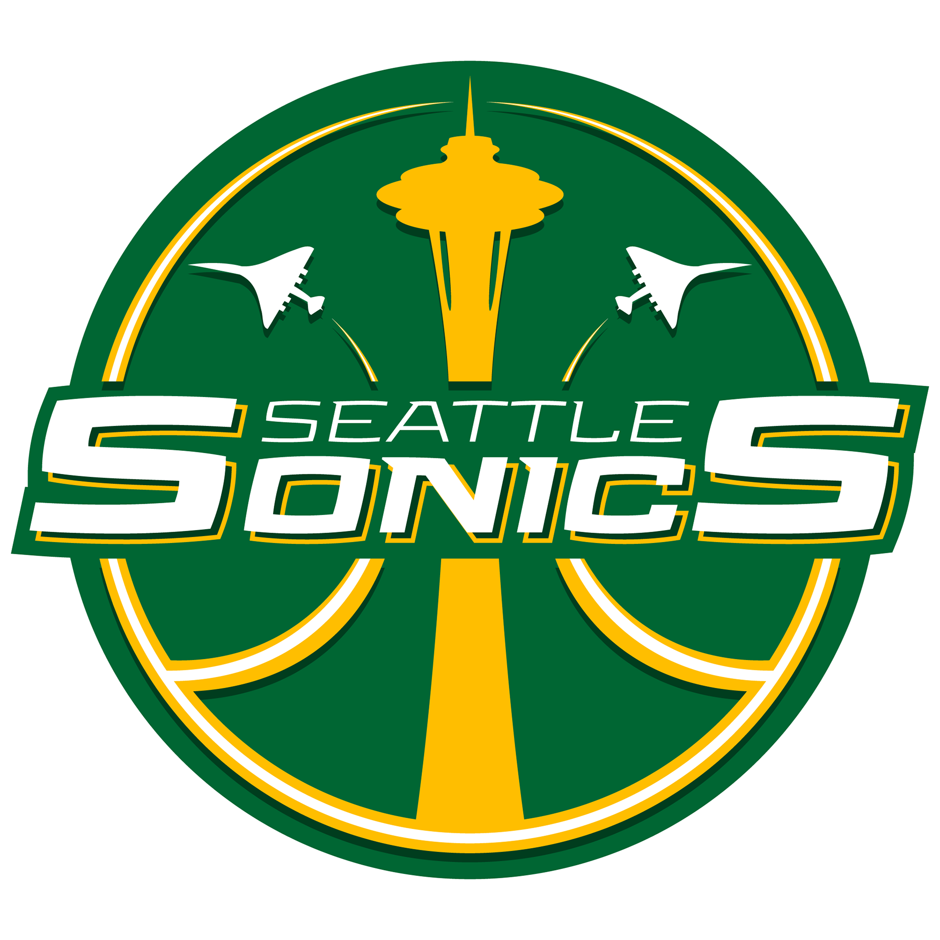
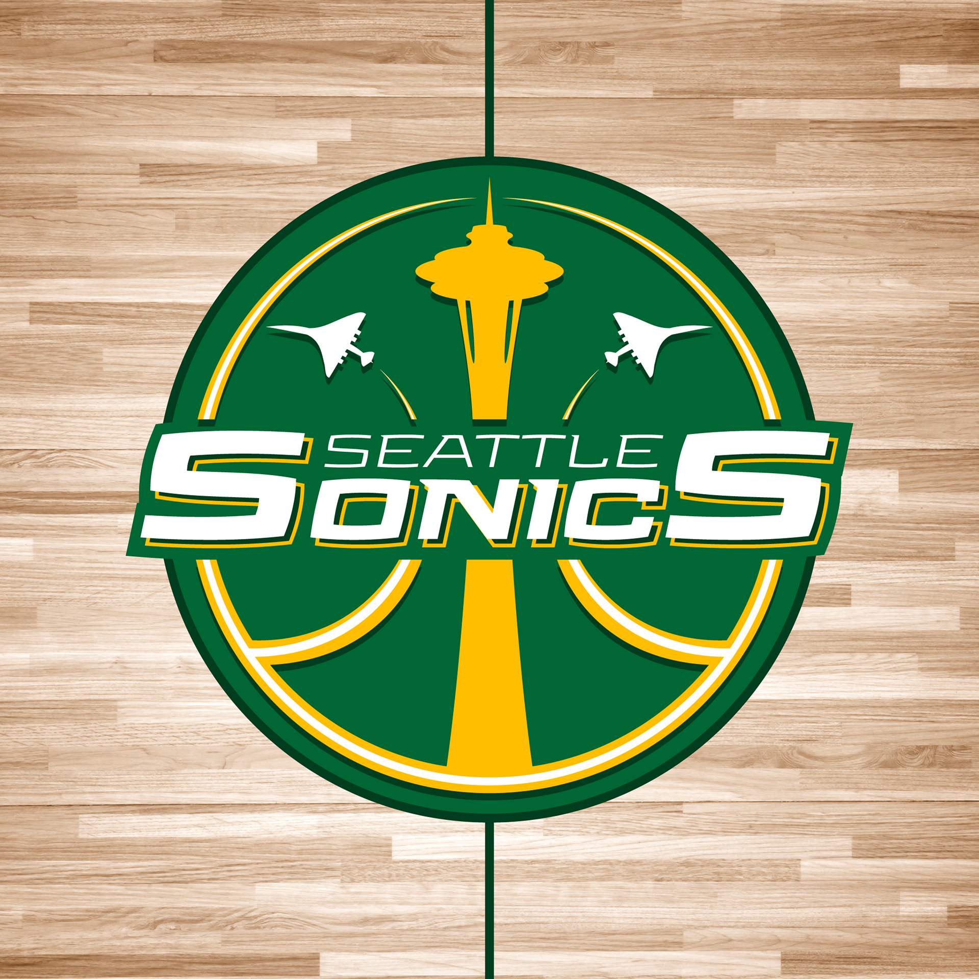
Primary logo.  I put the Seattle Space Needle in the center, and two airplanes (the Boeing from the contract), with the contrails, all of them forming a basketball with the circle around them.
Primary logo. I put the Seattle Space Needle in the center, and two airplanes (the Boeing from the contract), with the contrails, all of them forming a basketball with the circle around them.
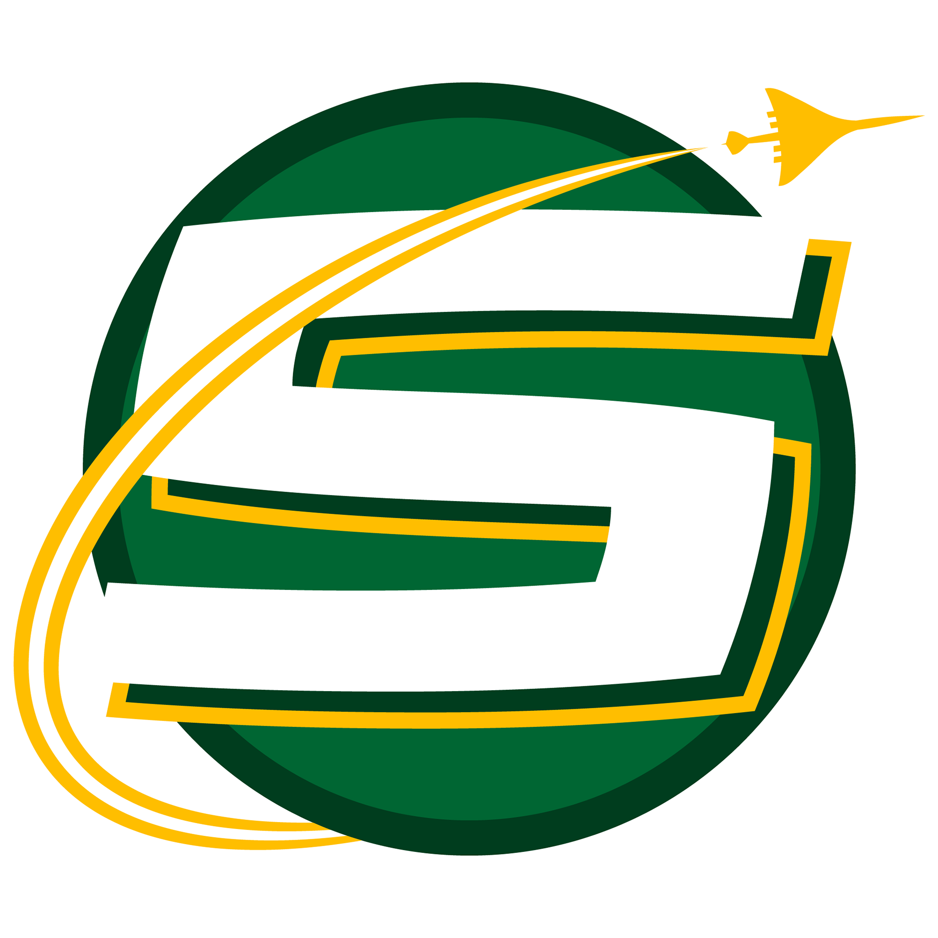
Secondary logo.  I went with the S from "SuperSonics" with one plane and its contrail.
Secondary logo. I went with the S from "SuperSonics" with one plane and its contrail.
Arena logo.  Actual name, but I didn't find any logo yet (the arena should open in 2021).
Arena logo. Actual name, but I didn't find any logo yet (the arena should open in 2021).
Primary logo on hardwood floor.
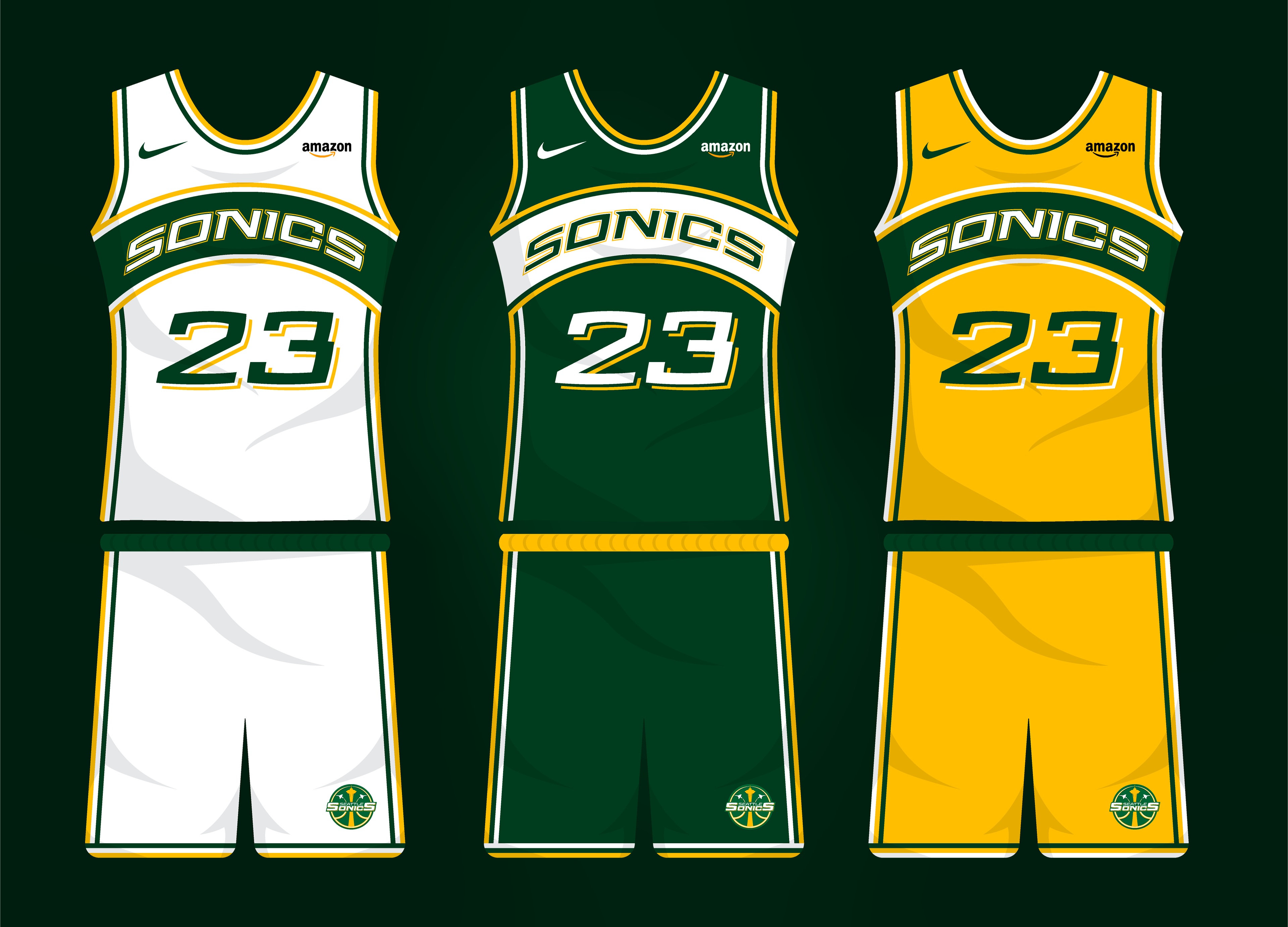
Association, Icon and Statement jerseys.  I went for the classic style of the franchise. with some minor modifications. And of course the Amazon logo is there just because it's based in Seattle.
Association, Icon and Statement jerseys. I went for the classic style of the franchise. with some minor modifications. And of course the Amazon logo is there just because it's based in Seattle.
Wordmark on light background.
Wordmark on dark background.

Why don't you check these?

Back to Top